The puppetry theatre


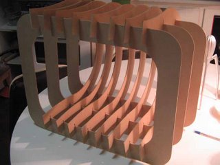
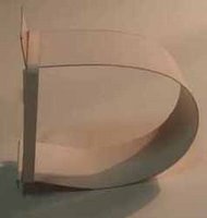
 The 3mm MDF is quite flexible, in most circumstances it will make a complete loop. This design would only require a few rectangular cuts.
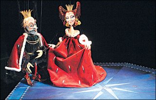
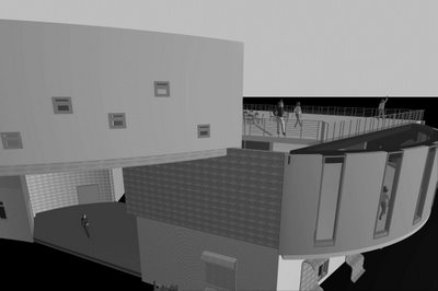
The puppet theatre can be a very symbolic space. The designs that I have seen on the internet offer a very simple 3 dimensional experience. By incorporating a traditional division of the stage wings into three layers, with three on each side. This allows for quick introduction of characters and changes to set scenery.
regards
Bill
 regards
BIll



 Bill
Bill
 Philippe Starck has a beautiful object, that is a fact. However one has to look at both sides of the argument. The function of both lemon
squeezers are extremely credible. The cost is very different. The 'Coles' variety lemon squeezer that I purchased for 0.98 cents is a bargain. But
then the exorbidant price of a Starck designed lemon squeezer is $134.90. A large portion of that money goes to Alessi. The look is great and suprisingly the performance is much better than the cheaper version. I honestly thought it would not live up to the 'high profile' expectations that the design community has placed upon this design. The normal squeezer reqiures two hands as shown in photo. The Starck squeezer can be operated with only one hand, quite easily. To be honest I have used it three or four times in my life and I mainly look at the Starck design as an icon and not an object of everyday use. My squeezer was bought as an

 Bill
Bill
 Bill reporting:
http://www.youtube.com/watch?v=3M7qBMWVh7I
This guy has taken graffiti into the new digital millennium. His use of 'relationship points', to generate patterns on the fascade of the building is quite unique. The use of a PC and projector allows him to plot the points (from random illuminated windows) and then create a line. These lines then make up the webbing that the PC software created. A great interactive concept. I utilised a similar formal approach in regards to my group concept design. This outlined within an earlier posting, 'evolution of the puzzle design'. These points of association can be fixed by discussing the value of two points on a master plan in relation to each other; or it can be as casual as plotting the illuminated windows on a high rise building at random....
regards
Bill.


 http://www.youtube.com/watch?v=KtpZLOrijW8
This student project depicting a museum plaza proposal is the best I have ever seen. The grand foyer elevated and nestled between the interlocking skyscrapers is one of my favourite scenes. The different use of delayed photography has been overlayed with a foreground CAD-model. I couldn't believe the amount of mixed multi-media used to achieve such a thorough and absorbing presentation. (see how many people involved within ending credits). The mix between architecture and film has been a long standing tradition. They seem to compliment eachother, in a visionary experience that is unprecedented within a wide section of visual media.
http://www.youtube.com/watch?v=KtpZLOrijW8
http://www.youtube.com/watch?v=KtpZLOrijW8
This student project depicting a museum plaza proposal is the best I have ever seen. The grand foyer elevated and nestled between the interlocking skyscrapers is one of my favourite scenes. The different use of delayed photography has been overlayed with a foreground CAD-model. I couldn't believe the amount of mixed multi-media used to achieve such a thorough and absorbing presentation. (see how many people involved within ending credits). The mix between architecture and film has been a long standing tradition. They seem to compliment eachother, in a visionary experience that is unprecedented within a wide section of visual media.
http://www.youtube.com/watch?v=KtpZLOrijW8
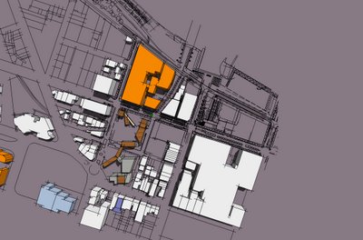
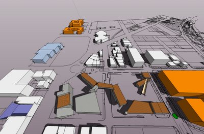
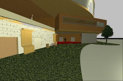
 precedent studies of other schools of industrial design around the world give great conceptual ideas and inspiration. I would like to comment on the University of Canberra in Australian Capital Territory.
![]()
 Gardens within the Geelong wedge.
My group like many others, have come up with a scheme that extends Cunningham St through the wedge.
 Weather conditions (wind/sun): High speed wind coming from geelong bay. Wind tunnel effect. All four seasons are relevant within this environment. Sun rises and moves from the East and set in the west. Summer has higher angles, winter has lower angles. Local area experiences morning and night fog. Chilly and high wind from ocean.

 Topography: Original and existing. Deakin University is a four level byuilding and so are most of the surroung buildings that face onto the applied design site. Gym building is a two level structure facing North East. The south east corner has a 3 level building called the 'Nireeda Apartments'. This building is very close to the site and has quite a prescense within the small intersection of Corio st and Clare st.
 Existing buildings (keep or remove): Deakin University we are definately keeping. The existing carpark on Broughan st we are not sure whether we are keeping to build on top, or to demolish and create an equally big car park within the existing adjacent car zone. Change bus zone to a smaller less intense area. Gesign entry hub for traffic, vehicles and pedestrians to enter the university precinct from most roads.

Proximities to car parking, shops and oth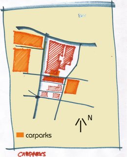 er parts of campus; 4 existing car parks plus to small basement car parks in the existing Deakin university and the existing gym. There is mainly 2 hour and 4 hour parking within the surrounding streets accept for the bus zones. Shops are facing campus on Brougham St, but no shops actually within the campus. Large open air courtyard within Deakin University campus.
Site history impact on new buildings; Many heritage listed buildings. After Aboriginal first white men came to the region in 1801. In 1852 the goldrush hit and placed Geelong on the map. he waterfront region had a major manufacturing company Ford arrive to the region in 1925. The Ford Motor Company commenced its company on Geelong's waterfront in 1925 close to where the Ford Discovery Centre stands today, before building its first Australian production factory on the highway in North Geelong. The waterfront region has rich wool industry culture. Many of the buildings use to trade from this area to the pier.
Easements, services; that impact on design. Truck and bus clearance. Presently there are different widths for roads and footpaths within the surrounding site. Plumbing and electrical grids for waterfront geelong. Local council drawings .
.
Lynchian analysis; Nodes, pathways, districts and boundaries: Kevin Lynch states that there are five elements to the "Lynchian Analysis" Paths, edges, districts, nodes and landmarks. The boundaries of the Geelong district are shown by existing main highways, trainlines and bridges. The train lines segment the north and south Geelong districts. 
Metaphysical aspects, site chi, energy flows and Genius Loci; Locations of distinctive atmosphere, light can play a big role in revealing the Genius Loci of an interior space or site. In Roman mythodology Genius Loci was the protective spirit of place. When we relate to a site we utilise creative spirit, and Genius Loci is a reference to that creative spirit.
Overlooking privacy views in and out of site; Pub and Nireeda Apartments are directly adjacent to the site. There are views to the site from Deakin University courtyard. Eastern units are overlooking the site, as they are five levels high.
Relationship to edges active and non active edges; Brougham St is a highly active street with, shops, parking and bus stops. The bus zone on Gheringhap St deadens this wide space. Transit Place is a one way St making it quiet and very narrow. 
Plot ratio, number of levels, open and built up spaces; Open courtyard at Deakin University. Built up apartment blocks and car parks, 3 - 5 levels high. Different sloping angles across the site. The site terrains differs with angles at 4 specific areas.
Landscape, Flora, Fauna; Medium size trees on Gheringhap St. Raised grass garden beds outside Deakin Uni along Gheringhap.
Day and Night use in consideration of 24 hour site use; Car Park can be used as a rave venue or nightclub venue to expand such spaces within a 24 hour zone. Students may start to use the area more at night if there are more places to eat shop and work during night hours.
Other relevant topics: number of buildings in block, perceptions of safety, key landmark buildings and features, building vacancy rate, vehicle and pedestrian activities, topographical characteristics, levels of compatibility, street amenities, furniture lighting;